CSS Box
CSS Basics � Part 6
CSS Course
Foreword: In this part of the series, we look at characteristics of the box and related features.
By: Chrysanthus Date Published: 15 Dec 2015
Introduction
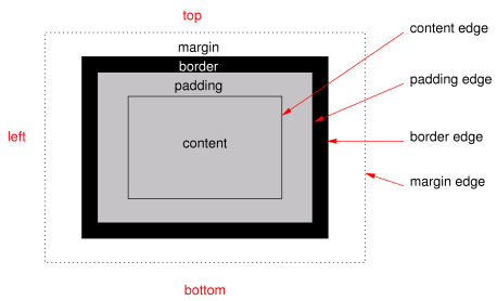
The Box
The diagram (copied from the w3c specification) shows the box.
The diagram is not drawn to scale. Now, any element has a core content area surrounded with optional padding, border and margin rectangular strips. So some elements may have borders, while others may not. Some elements may have padding while others may not. Some elements may have margins while others may not.
The content is the official viewing part. With some elements you see the border. The rectangular strip between the content and the border is the padding area. The border itself is also a rectangular strip. Surrounding the border is the margin strip. If the element has a background color or image, you see the color or image in the padding area, everything being equal. You may not see the background color or image through the content portion, unless the content portion has transparent parts. The border (strip), if present can have a color. The margin strip is always transparent and you can look through it to see the background (color or image) of the HTML body element, everything being equal.
The width of the element is the width of the content area. The height of the element is the height of the content area. You can use CSS properties to make the padding and/or border and/or margin present or absent for the element. The presence of any of these three things effectively increases the element�s width and height. You can use CSS properties to give the element (content area) a particular width and height. There is more to the dimensions of content area, padding, border and margin � see later.
Block-Level and Inline-Level HTML Elements
A block-level HTML element is an element that has an intrinsic line break element in front and after it. Examples of such elements are the DIV and Paragraph elements. An inline-level HTML element does not have any intrinsic line break element in front and after it. Inline-level elements fit themselves just like text, in a line and may wrap onto the next line. The height of the highest inline element determines the height of the line in which it belongs.
Element with Multiple Boxes
An HTML span element for example, may start in the middle of one line; continue to the end of the line; occupies the whole next line; and then continue halfway in the following line. Such an element would have three boxes for the texts in the three lines.
A containing HTML element is an element that can contain other (smaller) HTML elements. A containing element can house other containing elements. Block-Level Elements are containing elements. Since a containing element has an intrinsic line break element in front and after it, it always occupies a complete horizontal stripe in its own containing element (e.g. BODY element) from the left edge of its containing element to the right edge of its containing element.
Note: you can use a CSS property to change a block-level element to an inline-level element and vise-versa. However, browsers may not respect some of the results.
Note: It is note only block-level elements that have padding, border and margin; inline-level elements also have these properties, but they fit themselves in a line. Inline-level elements and text would fit (mixed) on one line in your HTML document.
Units of Measurement
The content area, padding, border and margin for any element has dimensions. These dimensions have units of measurements. You can measure them with what is called the Pixel, or em or Percentage.
The Pixel
The Pixel abbreviated, px, is the smallest dot that can be displayed on your computer screen. So, if the width of your element (content) is said to be 250px, it means the top or bottom edge consists of 250 dots.
The em
This unit is related to what is called the Font (see later).
The Percentage
The Percentage is abbreviated, %. If they say the width of an element is 75%, it means that the width is 75% the width of its containing element. If a Paragraph element is in a DIV element and it is said that its width is 75%, it means that the width is 75% the width of the DIV element. The percentage unit is always relative to some CSS property as this example illustrates; the CSS property may be that of a different element or the element itself.
Typing the Unit
When typing the unit you use the abbreviation and not the full name. You also do not put a space between the figure and the unit. So you can have something like, 345px or 2em or 65%. Also note that 1px is not the same as 1em which is not the same as 1%.
Giving Dimensions to an Element
You can give the width and/or height to any visible HTML element using CSS. You have the �width� and �height� properties for this. Either of them can take a value in pixels or in percentage, or em. The following example illustrates this for a DIV element in pixels. Try the code.
<!DOCTYPE HTML>
<html>
<head>
<style type="text/css">
DIV {width:50px; height:50px;border:solid 1px black}
</style>
</head>
<body>
<div>
A DIV element
</div>
</body>
</html>
I will talk about the border property later. The following code is similar to the above, but the unit is percentage and not pixels. Try the code � the browser may not respect the height given.
<!DOCTYPE HTML>
<html>
<head>
<style type="text/css">
DIV {width:50%; height:50%;border:solid 1px black}
</style>
</head>
<body>
<div>
A DIV element
</div>
</body>
</html>
When designing your web page, you naturally can determine what the width of a containing element would be. However, you usually would not know how deep the containing element would be, since you would not know in advance how much text and small elements the containing element would take.
When designing a web page, whether you are using pixels or percentage, if you do not give a height value to an image or video or any other html element, the browser will give you the corresponding or appropriate height. So avoid giving a height value to any image or video or html element.
Note: the dimensions of the audio element is not determined by you, the coder. It is determined by the browser, everything being equal. The audio element is an inline element. So, as you design your page, know what to do and expect, so far as the placement of the audio element is concerned.
Screen Resolution
The pixel is the smallest dot that can be displayed on a computer screen. When you have a colorful picture on the screen, it is made up of pixel dots of different colors. The total number of pixels that a screen can display is called the Resolution of the screen. Different screens have different resolutions. From smartphones to desktop, some resolutions are: 320�480, 640�960, 1136�640, 1024�768, 1366�768 and 2048�1536. The first number for each resolution is for the width of the displayable screen and the second number is for the height. If you multiply the width by the height, you would have the total number of dots the screen can display.
Dimension of Image and Video
An image or video element at the server has already its dimensions. The dimensions you choose for the image or video in your web page for the browser, has to be the same as those at the server, or smaller. If you do not do this, you would loose resolution (sharpness) of the image or video. For the web page, you can simply code a width value that is the same as the one in the server or a smaller width value. Avoid working with the height.
More on Block-Level and Inline-Level Elements
As you add elements in the body element or in a div element, the elements fit themselves in a horizontal line. That is, the elements would be displayed in a horizontal line in the browser, everything being equal. If the elements are too many, they wrap into the next line. This behavior is called the Normal Flow of elements. In any horizontal line, the tallest element determines the height of the line. That is, the elements may have different heights, but the height of the line is that of the tallest element. This normal flow will always be respected independent of whether you type the elements horizontally or Vertically in the HTML document (text editor).
Illustration
For this illustration, you need two small images (image files) and the following HTML document. So copy two small images into the directory in which you will save the following code as an HTML file.
<!DOCTYPE HTML>
<html>
<head>
</head>
<body>
<span style="background-color:gold">A phrase</span> <img src="firstImg.gif" /> <span style="background-color:cyan">Another phrase</span> <img src="secondImg.gif" />
</body>
</html>
Using a text editor, type the code and save it as an HTML file and then open it in a browser; replace the image file names in the code with the actual image file names in your directory.
In the code, you have a span element, then a space, then an image element, then a space, then another span element, a space and finally an image. At the display, all these items are shown on a line of the body element. If the line is short, the elements are wrapped into the next line. Note: if any of the space is made by typing the spacebar more than once, at the browser, you would have only one space (equivalent to typing the spacebar once).
Using Line Break Elements
You can break the normal flow using the line break element (<br>). The line break element forces whatever is on its right on the line, to the next line. This is what happens with text; the same thing is applicable to elements. Try the following code and you will notice that the second span element and second image element are on the next line:
<!DOCTYPE HTML>
<html>
<head>
</head>
<body>
<span style="background-color:gold">A phrase</span> <img src="firstImg.gif" /> <br><span style="background-color:cyan">Another phrase</span> <img src="secondImg.gif" />
</body>
</html>
In the above code, the line break element has been included after the first image element. So at the display, you have two lines: The first line has the first span element and the first image element; the second line has the second span element and the second image element.
For the code just mentioned, there are two lines at the browser because of the line break element. So, if we want three lines at the browser from these four elements, all we need to do is to include a line break element in another position among the four elements. Try the following code and note that at the browser there are three lines:
<!DOCTYPE HTML>
<html>
<head>
</head>
<body>
<span style="background-color:gold">A phrase</span> <img src="firstImg.gif" /> <br><span style="background-color:cyan">Another phrase</span><br> <img src="secondImg.gif" />
</body>
</html>
In the code you have a line break element just before the second span element and just after this same span element. In the first line at the display (browser) you have the first span element and the first image element; in the second line, you have only the second span element; in the third line you have the second image element. So we have got three lines from a series of elements. We achieved this simply by putting two line break elements at different positions among the four elements. If you do not use the line break elements, you would only have new lines as a result of element wrapping at the end of the line (just like with text wrapping in a word processor).
I want you to note that in the above code, we have a line break element just before the second span element and just after it. In this way the second span element stands alone on a line. The HTML developers made some elements like this. Such an element has an implicit line break element just before it and just after it. Well, you the web site designer do not see these line break elements of the elements, in your code. Such stand alone elements are called block-level elements. Examples of block-level elements that we have seen, are the div element, the hr element and the p element. Try the following code to demonstrate this:
<!DOCTYPE HTML>
<html>
<head>
</head>
<body>
<div>DIV Element</div> <p>Paragraph Element</p> <hr />
</body>
</html>
Each of the above block-level elements occupies a horizontal stripe (line) at the browser. With inline elements (elements like the image elements that would be on one line), a space in between two inline elements fits itself in the normal flow. With block-level elements a space in between two block-level elements should fit itself in a separate line in between the two block level elements (at the browser). This is because the line break element just after the previous block-level element forces whatever comes after it to the next line and the line break element just before the next block-level element forces the block-level element to a new line. Well, in practice, when a browser sees a space between two block-level elements it might not display the space and so one block-level element would appear immediately below the previous block-level element.
If you want a blank line in between two block-level elements, include the line break element in between the two block-level elements in the code. Try the following example and note that there is a blank line between the div element and the p element.
<!DOCTYPE HTML>
<html>
<head>
</head>
<body>
<div>DIV Element</div> <br><p>Paragraph Element</p> <hr />
</body>
</html>
A containing element is an element that can house other elements. An inline-level element is an element that fits itself within a line of text. A block-level element is an element whose width is the width of the containing element.
List of Inline Elements
- All text level elements, e.g. the strong and the time elements
- span element
- Image element
- audio element
- video element
- All form controls, e.g. the button control
- label element
List of Block Level Elements
- All section elements e.g. the article element
- All heading elements, e.g. h1
- table element
- All grouping elements (p, hr, pre, blockquote, ol, ul, li, dl, dt, dd, figure, div)
Converting a Block Level Element to an Inline Element
You can convert a block element to an inline element. To do this, use the following attribute and value in the start tag of the element:
style="display:inline"
With this, the element should fit itself within a line of text. The height of the line becomes the height of the highest element in the line.
Inline to Block Element?
You can convert an inline element to a block level element. To do this, use the following attribute and value in the start tag of the element:
style="display:block"
Time to take a break. We stop here for now. Rendezvous in the next part of the series.
Chrys
Related Links
Basics of HTML 5Basics of ECMAScript
HTML DOM Basics
CSS Basics
CSS Rendering for HTML
Simple Guide to Website Design
CSS Multi-column Layout Module
Media and CSS
Responsive Web Design
More Related Links
PurePerl MySQL API
Major in Website Design
Perl Course - Optimized
Web Development Course
BACK NEXT